
You’ve spent days working on a new dashboard and are ready to demo it to your users but it’s just not performing up to expectations. We’ve all heard the statistics about a user’s attention span and how long they might be willing to wait for a response to a click before they lose focus and patience. This is can be a significant problem for dashboard developers who are working with large data volumes hosted on databases over which they have no control. No matter how beautiful and valuable the information you are presenting is, if it does not perform people will not use it.
In this blog post I plan to discuss some of the variables that can affect dashboard performance and help you put together a recipe for highly performant dashboards and reports.
Performance Variables
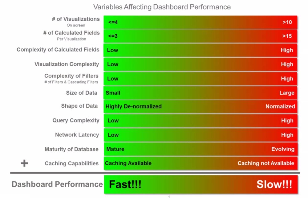
Dashboard performance is driven primarily by 11 variables which together dictate how responsive your dashboard will be. The following diagram summarizes how these variables impact overall dashboard performance.
Caching Capabilities
We’ll start with the variable that many beginner dashboard developers view as the silver bullet for addressing dashboard performance. Just extract the data and cache it. The leaders in the data viz space (Tableau, Qlik) both offer proprietary caching layers which in many cases can solve a multitude of performance problems. These caching mechanisms basically extract the data from source database and create a replica on the host server that is compressed in an in-memory format and optimized to the vendors calculation and rendering engine eliminating round trips to the database every time a user interacts with a dashboard.
These capabilities, while very effective do have limitations which should be considered and in certain cases may make caching a non-starter. These limitations include:
- Size limitations – Depending on the size of your underlying data set, you may not be able to fit all of the data required into memory. This can be particularly true for addressing requirements that necessitate access to full historical data for trending, time series analysis or period over period comparisons.
- Latency – The size of your underlying database and the transformations you build into your caching job will dictate the time required to generate your cache files. This may make high performance/low-latency dashboarding requirements very difficult to achieve for large complex data sets.
- Fine Grained Data Access Controls – Larger organizations will undeniably have use cases which restrict what information one user might have access to vs another. These can be regional, departmental or customer based restrictions. While the leaders in this space all provide robust data entitlement capabilities, this will likely require a redundant access control solution in your caching layer from the access controls which might exist in your data lake/mart/reservoir/etc. Data access controls can get quite complex and having redundant solutions will lead to inefficiencies and the potential for those access controls to get out of sync.
# of Visualizations on a Page
It’s very tempting to layer a dashboard with a large number of data points to make it an eye catching visualization. This is however not considered a best practice since it can lead to information overload for the consumer. This practice also has a direct impact on the query performance since each visualization results in at least one query to the underlying data sources. With Tableau for example, it’s quite easy to get to a point where a dashboard is firing 30-40 queries to paint every pixel on the screen. Some of those queries can have dependencies on other queries reducing degree of parallelism with the queries are executed. Unless you are getting response times from your database that are <2-3 seconds, it will become very difficult to achieve performance SLA’s that are in the 5-10 second range.
# of Calculated Fields/Complexity of Calculated Fields
As a best practice, it’s recommended to keeping your dashboards as dumb and simple as possible and pushing the business logic to the underlying database. Three primary reasons for this:
- Single Version of the Truth: Rarely will one dashboard satisfy the needs of all of your users. They will typically require different slices of the same data across different dashboards tailored to specific use cases. Embedding that business logic into the dashboard/report layer results in that logic being replicated across dashboards and eventually getting out sync resulting in different versions of the truth.
- Maintenance As your dashboard inventory grows, unless you’ve centralized your business logic in the data layer, maintaining the various versions of your business logic distributed across all of your dashboards will become a unsustainable task.
- Performance KISS principle applies here. By keeping your dashboard simple and free of business logic, you free up memory by bringing in only the required data, and reduce CPU cycles allowing your tool to focus on just painting pixels.
Visualization Complexity
Ok, so this one isn’t really a problem with actual visualizations but rather tabular layouts. Old habits die hard with some users. There will always be requirements to present data in a tabular or scorecard format. Where problems occur is when we try to split the rows or columns across multiple attributes. Consider an expense report that which is presented as a single table breaking out expense line items by the following:
- Current Month Expenses
- Prior Month Expense
- Month Over Month Variance
- YTD Expenses
- Prior Year YTD Expenses
- Year over Year Variance
- Break out by Region
- Break out by Department
This type of tabular scorecard can result in (depending on your data model) at minimum 3 separate queries to get the Period over Period Results and then the regional and department breakouts. These all three queries will need to be executed before the table can be displayed and will likely be executed serially. Let’s assume each query takes 3 seconds, that’s a total of 9+ seconds between when a user clicks on the dash to applied a filter and the dashboard is rendered.
Complexity of Filters
Filters are without a doubt a very critical component of any dashboard. They allow you to slice your view by different dimensions giving you insights to details that you might otherwise not get from the visualizations present on the screen. Overuse however, can have a very negative impact on performance. Consider the following points when building your dashboard.
- Each filter is an additional round trip to your data source if your data is not cached. Tools like Tableau for example do not allow you to build your filters against small lookup tables. They always select the distinct set of values for your filter from the primary data source/query supporting your visualizations.
- Cascading or nested filters are also problematic against non-cached data sources because a round trip is required for all linked filters for the selected value of the parent filter.
- Adding detailed level filters also limits your ability to build aggregate data sets to support a good performing dashboard. For example, consider a dashboard that tracks your sales pipeline. You may want to provide a Region filter to get a detail view of each region. It may seem like a good idea to add a filter for Customer to see how we are performing with a given customer. Adding a Customer filter would significantly increase the volume of information you need to query. By keeping it at a region level you can pre-aggregate and persist all of your metrics to the Region level which should be an exponentially smaller data set then the data you would need to maintain at the customer level.
Size of Data
This one is simple math. The more data you need to query, the slower your supporting queries will perform. When dealing with large data volumes,
- Be aggressive about eliminating and pruning away any data points which will increase your row counts.
- Build aggregate result sets that are tailored to your dashboard requirements.
- If you’ve done all the necessary pruning and you’re data set remains quite large ensure that the database technology you are leveraging is capable of supporting those data volumes. More on that shortly.
Shape of Data
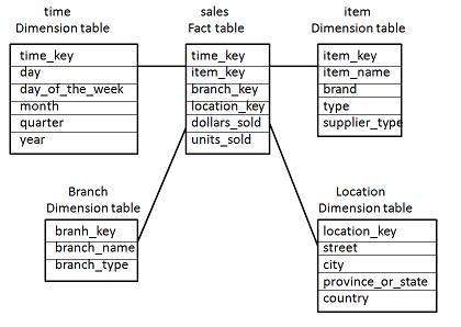
This one can be tricky. Traditional database design focused on eliminating data redundancy because disk was expansive. Best practices dictated that you normalize your data so that you only store a piece of information once. The star (& snowflake) schema model (see below) has long been the default modeling template for data warehousing and analytic initiatives.
The problem with this modeling approach is that joins between tables can become expensive especially when your fact and dimension tables grow into the millions.
Luckily, disk has become inexpensive thus making specialized result tables which are fully de-normalized (persisted with the results of all of your multi-table joins into a single wide table format) a very real option. This approach does have a down side which is the processing power and time required to build these tables which will inevitably increase the latency of your reportable data. Most of the time however this is an acceptable trade off.
Query Complexity
This one can be a performance killer!!! Query complexity can be driven by the shape of the data as described above but in this variable we are talking about business logic that typically gets embedded in the queries used to support analytic exercises including:
- Decode statements
- Count Distincts
- Common analytic functions (Rank, Moving Avg, NTile, Lead, Lag)
As a dashboard designer you will inevitably be faced with needing to support these types of analytic functions as part of delivering on requirements. If data volume and performance becomes a concern, look to tweak the other variables and look for opportunities to pre-calculate and persist your results so that you avoid these expensive functions at run time.
Network Latency
Typically, network latency is not a significant factor in the overall performance of your dashboards but it certainly does contribute to the overall response times. When faced with network latency issues, you’ll most likely need to get the assistance of system analysts and/or your devops team to research and remediate the bottlenecks in your network.
Maturity of Database
In order to reach optimal performance you must choose a database platform that aligns with the size and shape of your data. Traditional database vendors have matured their platforms over decades and support robust indexing strategies, concurrency requirements and have the full power of SQL to allow you to meet the requirements of your analytic queries. The problem with the traditional vendors is that they were unable to scale to terabyte and petabyte sized data sets.
In came Big Data to save the day. Well, not really….
While the big data NoSQL platforms can in fact process large volumes of information much more efficiently, they were not necessarily designed to support highly concurrent dashboarding/analytic requirements. The biggest problems these offerings have is supporting a large number of concurrent users due to the memory requirements to quickly aggregate/calculate large volumes of information. Niche players are coming in to help overcome some of these limitations. In fact, offerings from the likes of Snowflake, AtScale, Jethro, Esgyn & Dremio all seem to be finding success approaching the problems from different perspectives. (Note to self: good topic for another blog post) That said, Big Data offerings to support analytic/dashboarding requirements are quickly evolving and are at different levels of maturity so tread lightly.
In summary, no silver bullet exists to magically address dashboard performance issues. You’ll undoubtedly need to tune different variables to meet your SLA’s. My hope is that I’ve armed you with the information to at least know where to start looking for opportunities for improvement.
